Cliente: Camila Ferraz
Segmento: Sports Nutrition
Ano: 2025
Serviços: Branding, To build a brand that balances technical authority, human connection, and performance.
#Branding #Logo #Identity
Camila Ferraz is a sports nutritionist specializing in performance for runners, serving everyone from individuals taking their first steps into the sport to high-performance athletes. Her brand emerges from the intersection of science, care, and discipline, reflecting a strategic approach to nutrition focused on continuous improvement, athletic performance, and quality of life.
The challenge of the project was to create an identity capable of standing apart from the generic visual language commonly found in the sports nutrition industry. The brand needed to communicate technical authority without losing its human touch, balancing performance and care through a sophisticated, contemporary, and inspiring communication style tailored to the running community.
The solution was built upon a strategic foundation of archetypes, positioning, and visual direction. The result is a strong and scalable identity, designed to grow across multiple applications, from digital platforms to sportswear, creating a brand that communicates movement, confidence, and progress with every step.


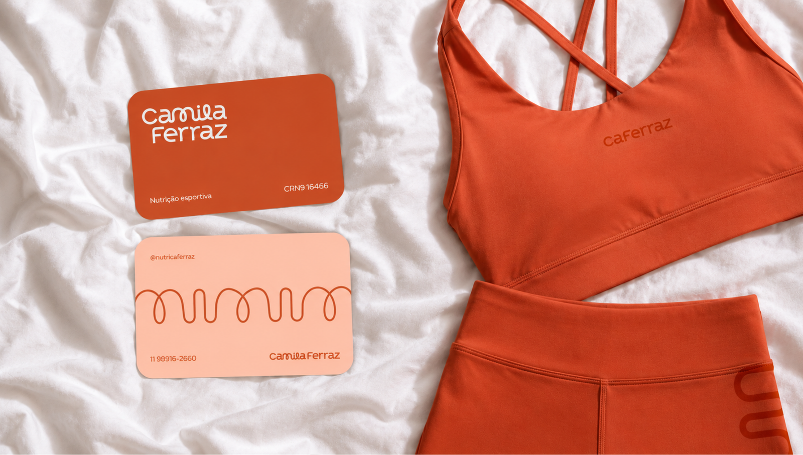
The Camila Ferraz project was developed to create a brand capable of bringing together athletic performance, human connection, and technical authority through strong and memorable communication. We developed the complete branding strategy, visual identity, creative direction, and brand applications, creating a visual system designed for digital, sports, and institutional environments.
The result is a solid, human-centered, and inspiring brand that strengthens its connection with runners while communicating confidence, progress, and professionalism at every touchpoint.



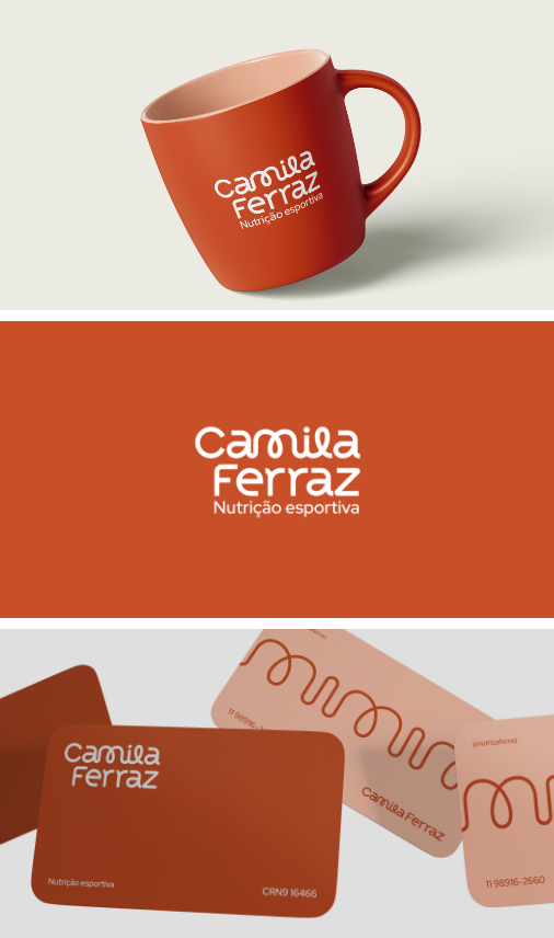
The brand application system was developed to maintain consistency, approachability, and visual strength across all touchpoints.


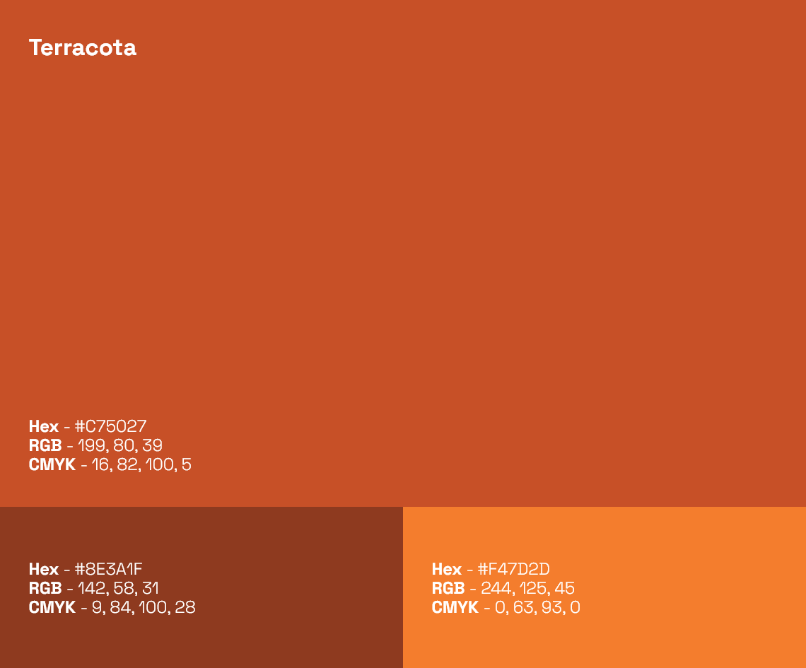
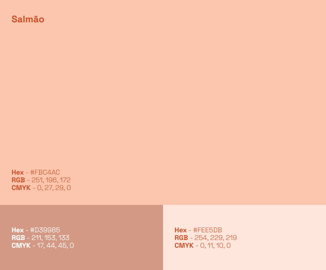
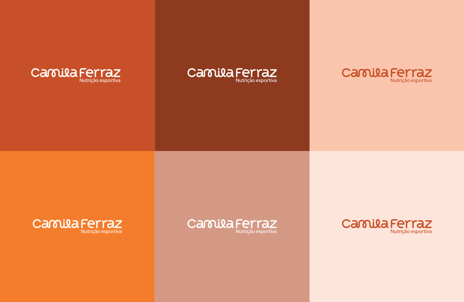
The color palette was designed to communicate balance, lightness, and trust.


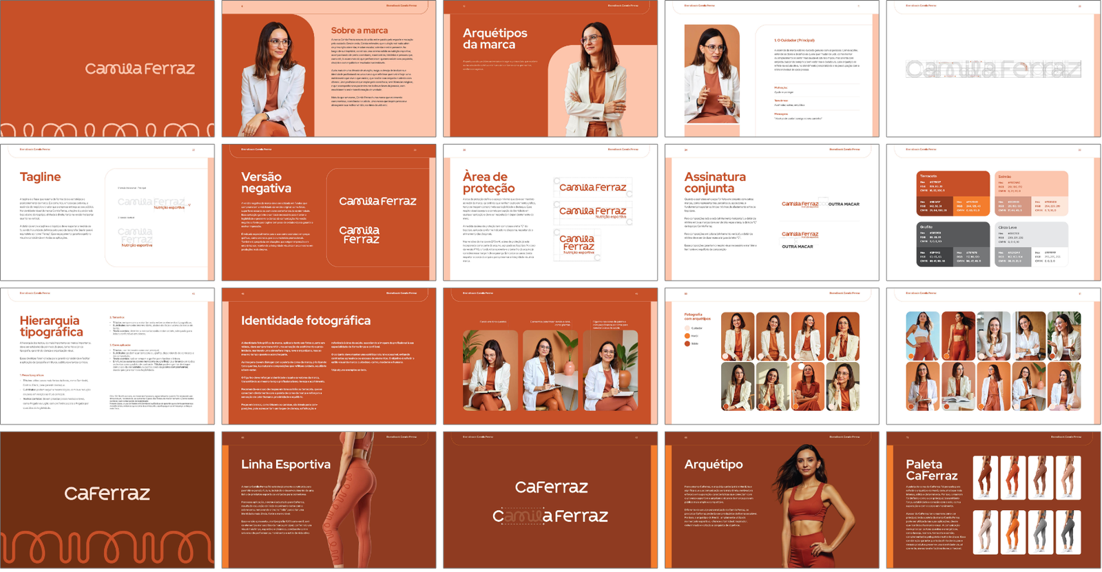




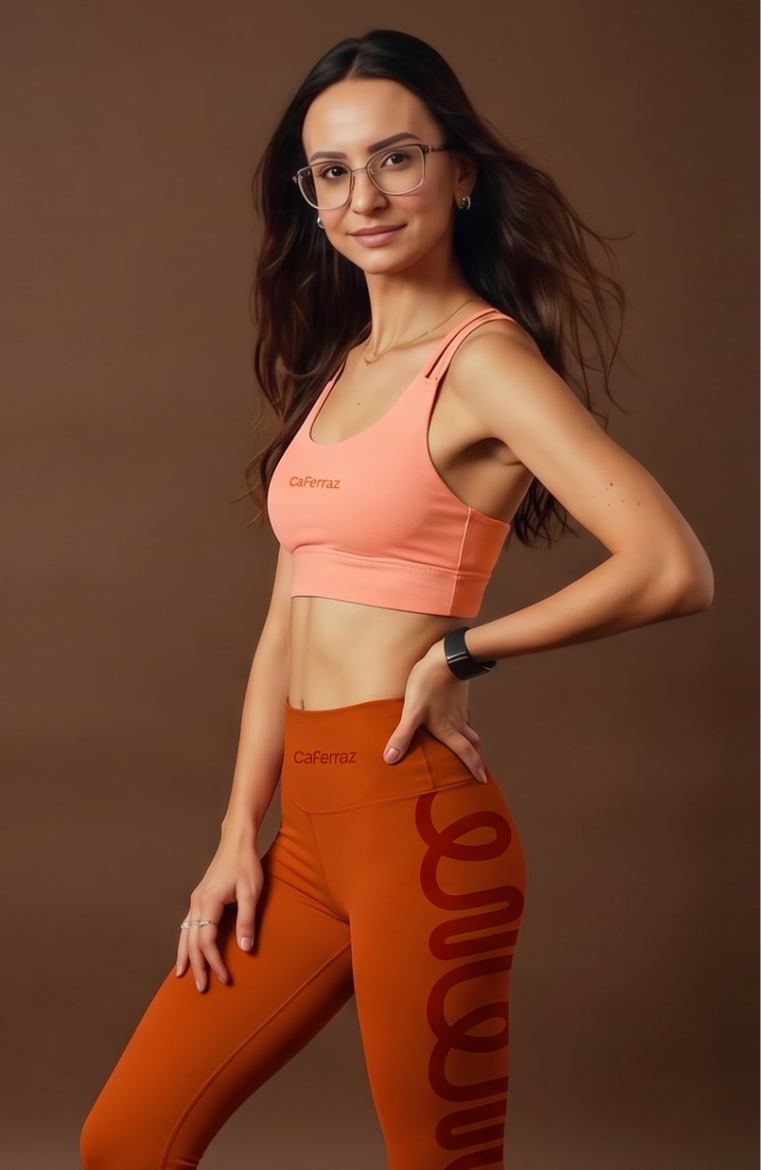
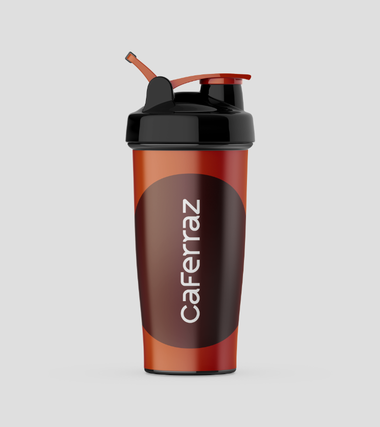
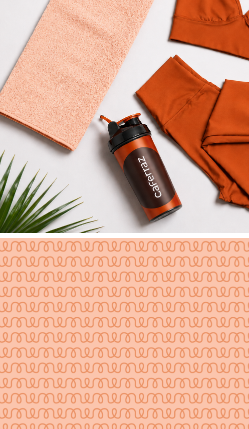
The Camila Ferraz brand was strategically designed to support future expansion, including the development of a sports product line tailored specifically for runners.
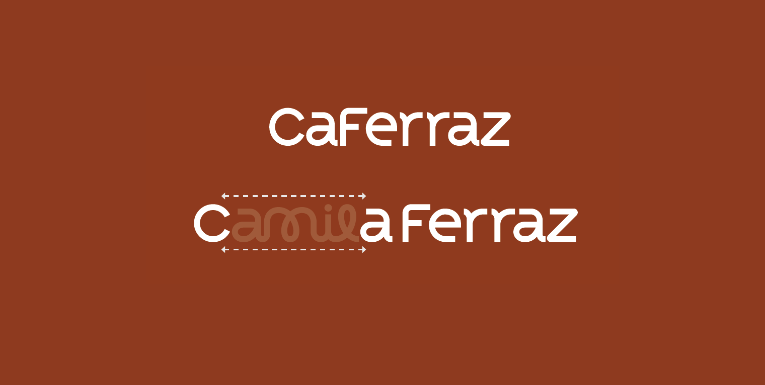
For this application, the name is adapted to CaFerraz, created by combining the beginning of the first name with the surname and removing the “mila” portion to create a stronger, more direct, and more impactful identity.
This version features a fully sans-serif typography system, without the handwritten elements present in the primary brand identity, resulting in a cleaner, more athletic, and dynamic appearance aligned with the world of performance, movement, and active lifestyles.