Cliente: Datasolutec
Segmento: Technology, Data Engineering & Artificial Intelligence
Ano: 2025
Serviços: Brand Strategy, Brand Positioning, Visual Identity, Brand Architecture
Objetivo do Projeto: To build a technology brand with a strong perception of authority, organization, and innovation, moving away from the generic visual conventions commonly found in the industry.
#Branding #Logo #Identity
As Datasolutec expanded its market presence and strengthened its expertise in data and artificial intelligence solutions, the company required a visual identity capable of communicating innovation, technical excellence, and credibility.
The project was developed from a concept centered on transforming information into knowledge. Every visual element was designed to represent organization, intelligence, and the flow of data through technological processes.
The symbol combines geometric structures that reference data organization and processing, creating a visual language aligned with the company's strategic positioning. The identity system was built to ensure consistency across digital and institutional applications while remaining flexible enough to support future growth.
The result is a modern and structured brand that reinforces Datasolutec's role as a strategic technology partner, capable of helping organizations unlock the full potential of their data through engineering, governance, analytics, and artificial intelligence.


The Datasolutec project was developed to position the brand as a technology company driven by intelligence, structure, and performance. The strategic approach aimed to break away from the industry's generic visual standards, creating a contemporary, solid, and institutional identity capable of communicating clarity, authority, and innovation.
RAAF developed the entire branding strategy, visual identity, graphic system, and communication direction, structuring the brand around the Hero, Ruler, and Sage archetypes. The result was a flexible and scalable identity designed for corporate, digital, and institutional applications, strengthening Datasolutec's perception as a strategic partner in data and artificial intelligence solutions.



The Datasolutec logo was built from the intersection of technology, structure, and strategic intelligence. Developed using a modular grid, the typography uses the letter “O” as the central element of the composition, combining a circular outline—which represents flow, processing, and connection—with a square negative space at its center, symbolizing organization, structured data, and control.
This semiotic construction visually translates the brand's core pillars: clarity, governance, and the transformation of data into actionable knowledge.


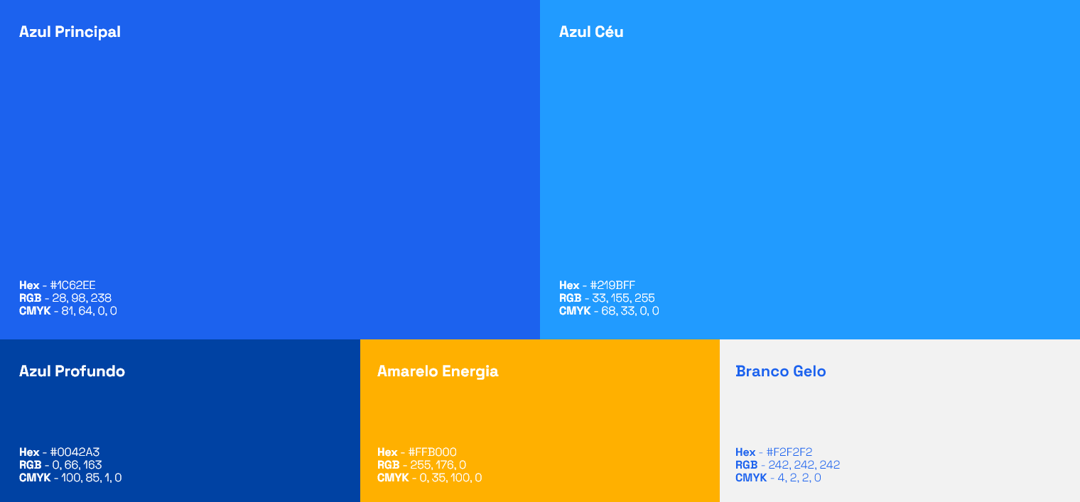
Datasolutec's institutional color palette was designed to balance action, authority, and intelligence, directly reflecting the hierarchy of the brand's archetypes.
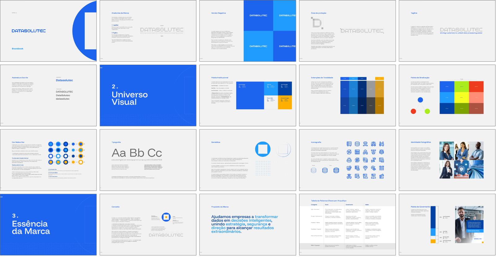
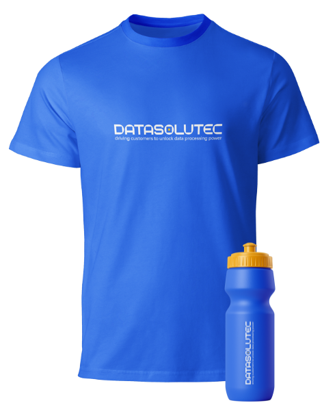
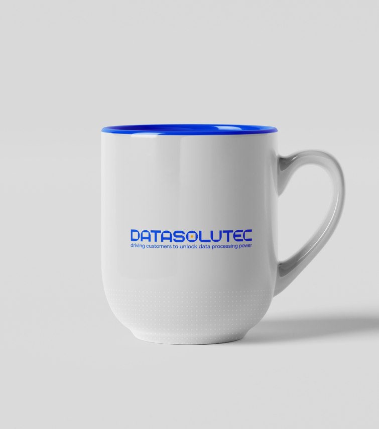
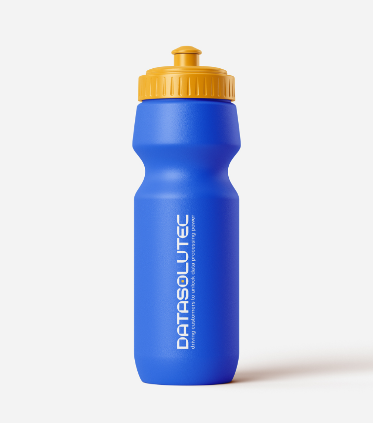
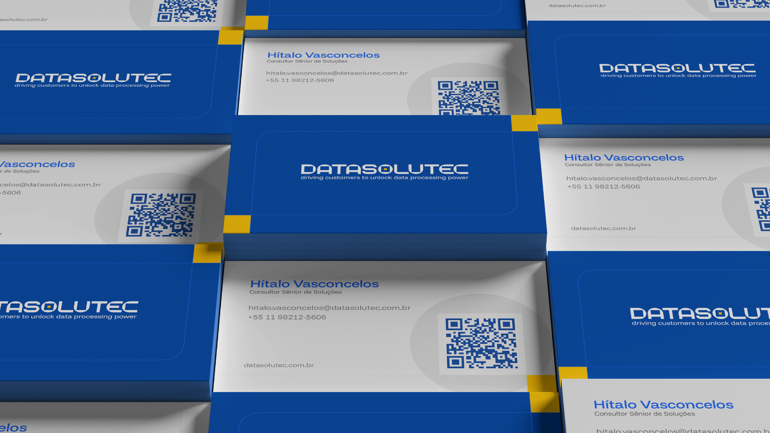
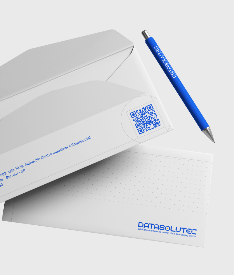
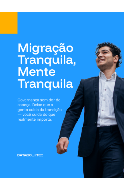
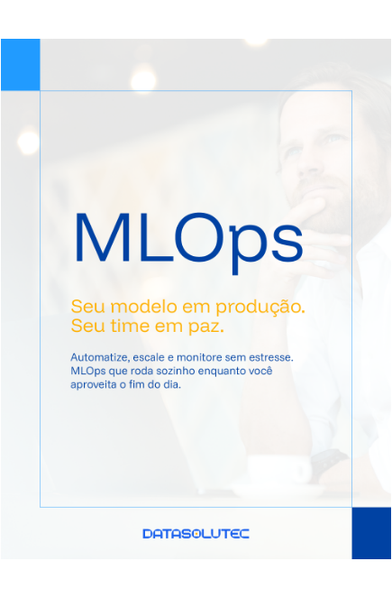
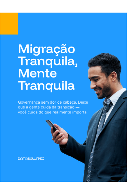
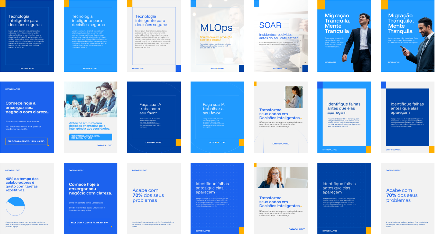
The brand application system was created to maintain clarity, organization, and visual impact across different contexts, ensuring consistent, technological, and strategic communication in both digital and institutional environments.

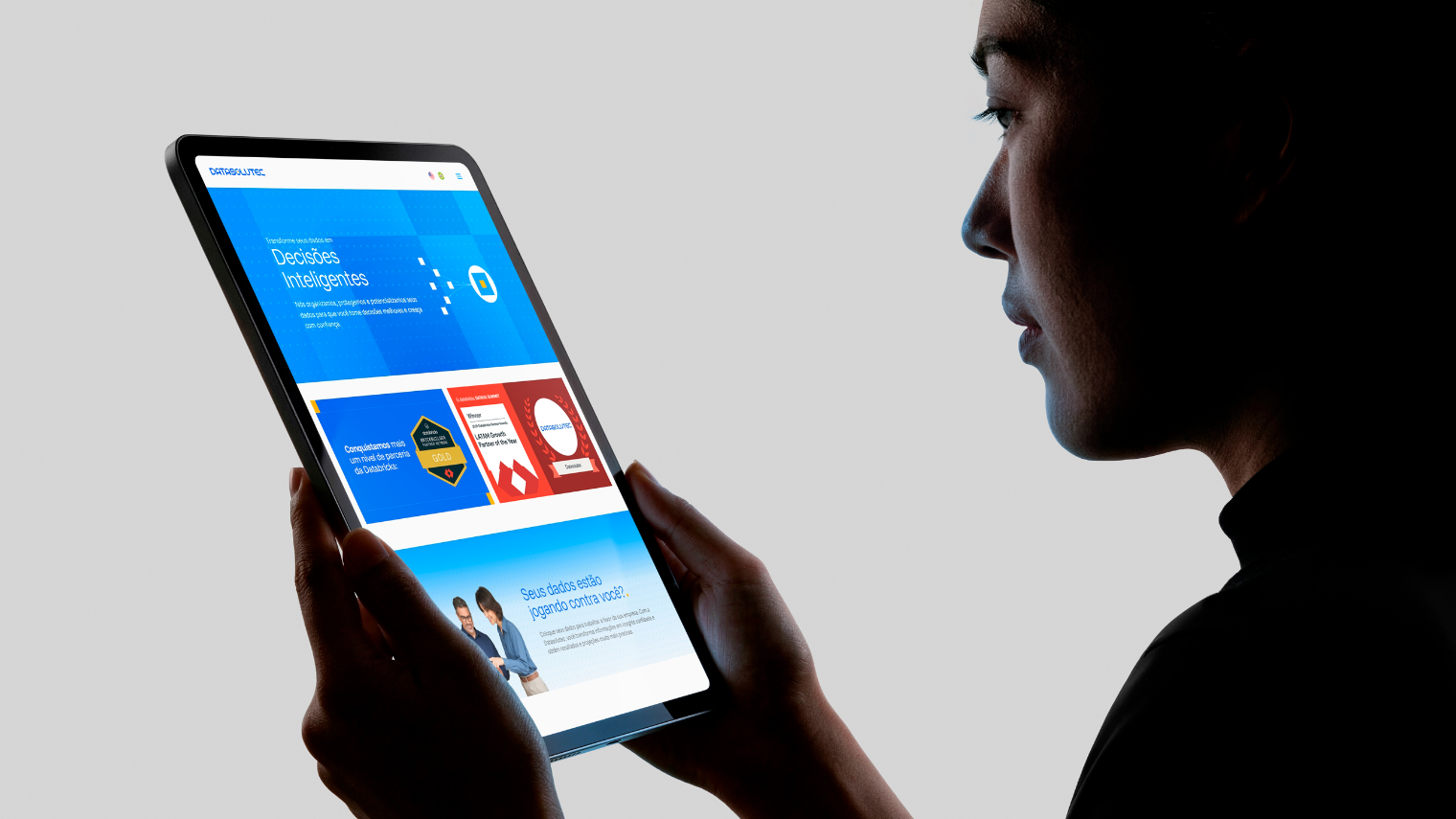
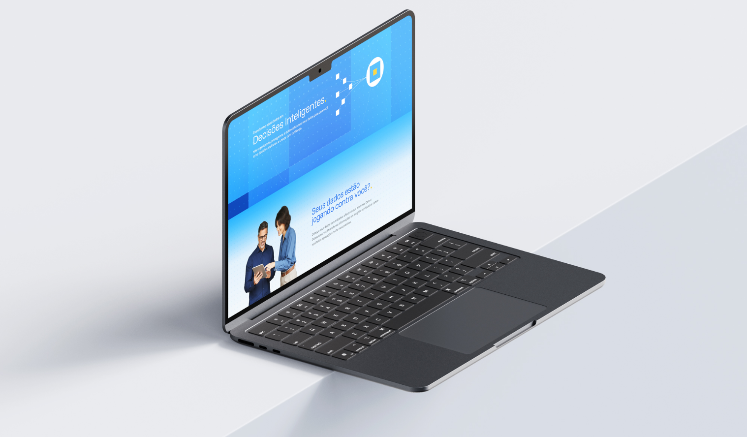
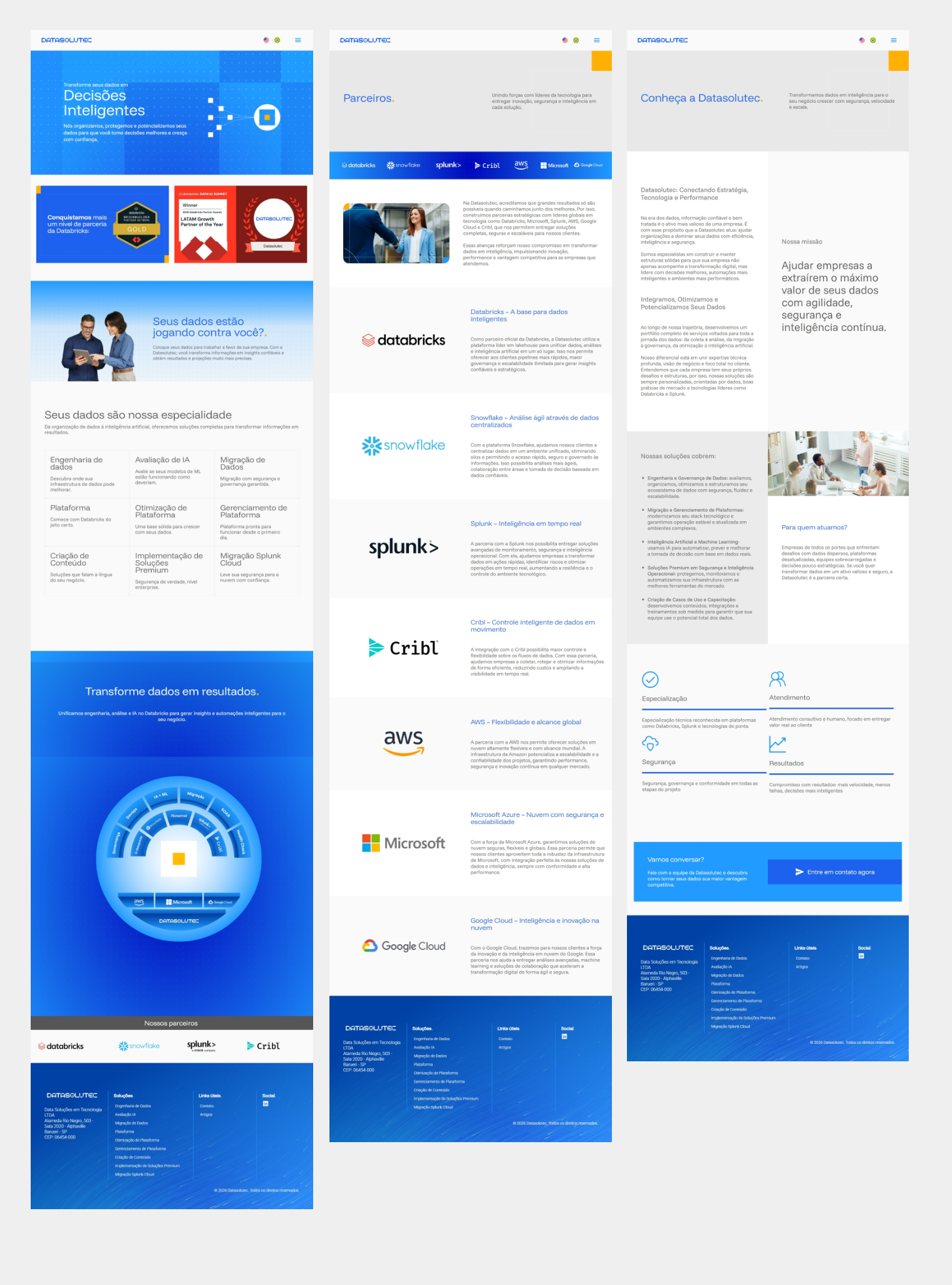
The Datasolutec website project was developed to translate the brand's new identity into a more strategic, contemporary, and institutional digital experience. Beyond reinforcing the company's positioning in the technology and data intelligence market, the new website elevated the brand's perceived value through a stronger, more organized visual communication aligned with the world of high-performance corporate businesses.