Cliente: Dona Bilu
Segmento: Beauty & Nail Care
Ano: 2021
Serviços: Visual Identity, Logo Design, Visual System, and Brand Guidelines
Objetivo do Projeto: To develop a distinctive visual identity that conveys delicacy, care, and excellence, strengthening the nail studio's positioning and differentiating it from the common visual standards of the industry.
#Logo #Identity #Motion
Dona Bilu is a nail studio born from the combination of care, beauty, and excellence in every detail. The project aimed to develop a unique visual identity capable of standing apart from the industry's common visual standards through a more delicate, sophisticated, and memorable communication approach. The brand was built around a custom-designed typeface inspired by the movement of nail polish flowing across the letters, reinforcing the essence of the business and the attention to detail present in every service offered.
We develop the complete visual identity for the brand, including the logo, typographic system, institutional color palette, and brand application guidelines. The result is an elegant, feminine, and welcoming brand designed to communicate professionalism and care across every customer touchpoint.

The Dona Bilu project was developed to create a visual identity capable of translating the quality of its services, attention to detail, and the welcoming experience offered by the nail studio. The brand development sought to move away from the overly saturated visual standards commonly found in the beauty industry, embracing a more elegant, light, and sophisticated visual language.
We developed the complete visual identity, including a custom logo, institutional color palette, and application guidelines, resulting in a memorable, feminine brand designed to strengthen its presence across all customer touchpoints.
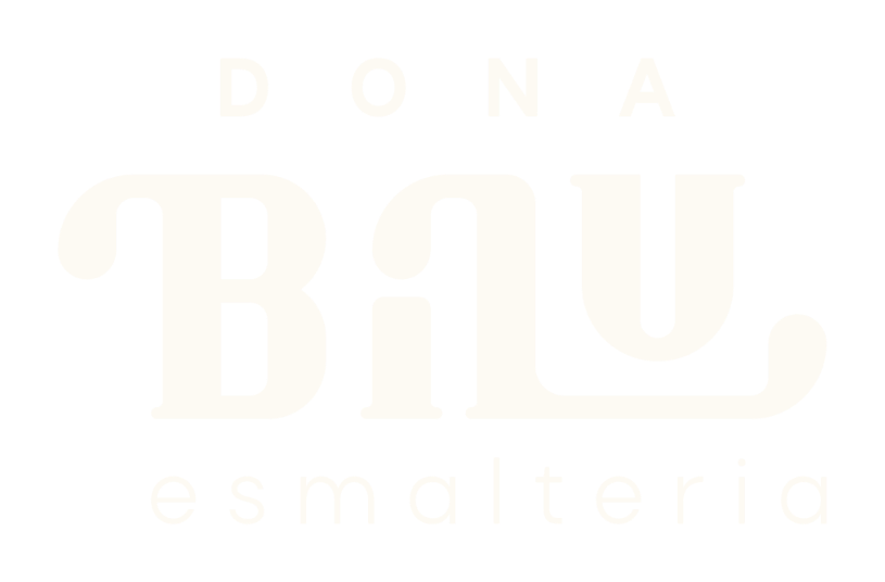


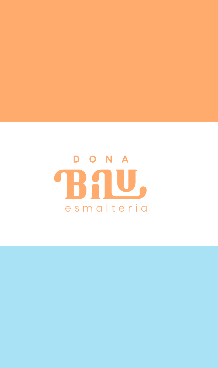
Dona Bilu's identity was built around a custom typeface inspired by the movement of nail polish flowing across the letters. The droplet-shaped terminals found in the letters “B” and “L” symbolize dripping nail polish, while the construction based on the Golden Ratio reinforces the perception of care, balance, and excellence.
The letters “B” and “L” also pay tribute to the founders, Bia and Lu, making the brand unique and rich in meaning.
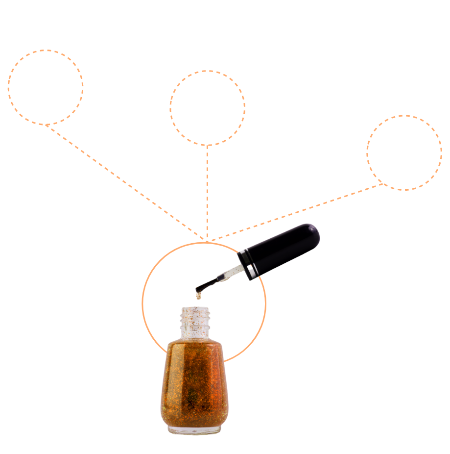
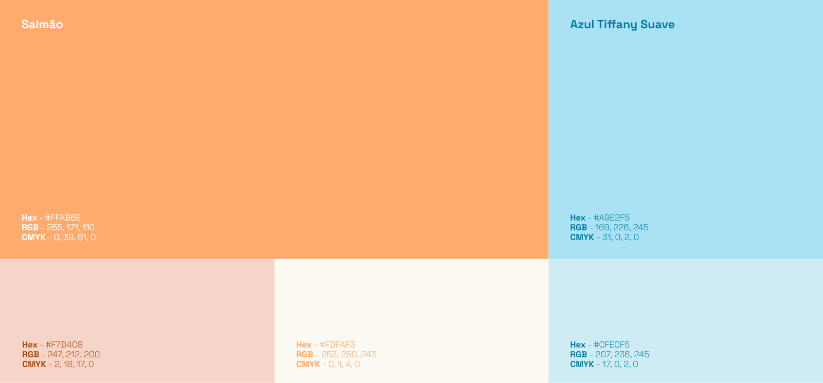
The institutional color palette was designed to communicate beauty, softness, and lightness. With carefully selected pastel tones, the identity distances itself from the excessively saturated colors commonly used in the industry, creating a more elegant, welcoming, and enjoyable brand experience.
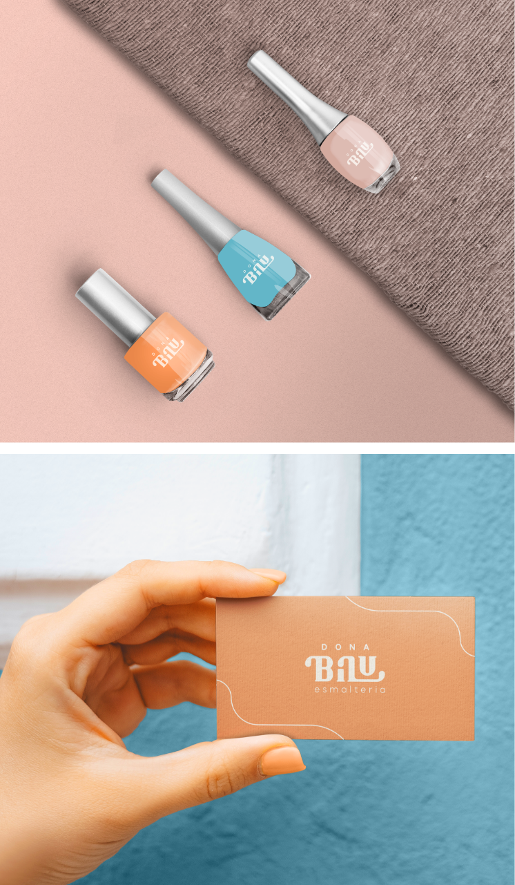
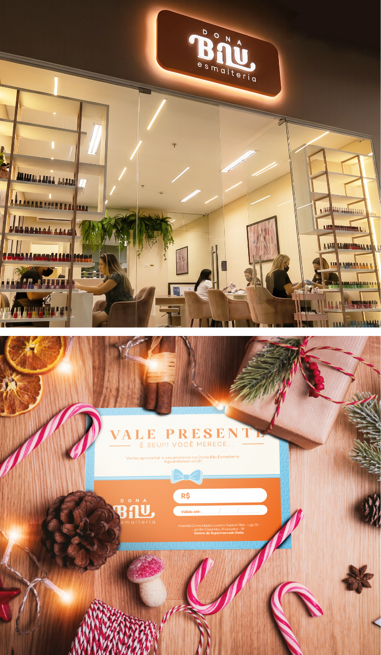
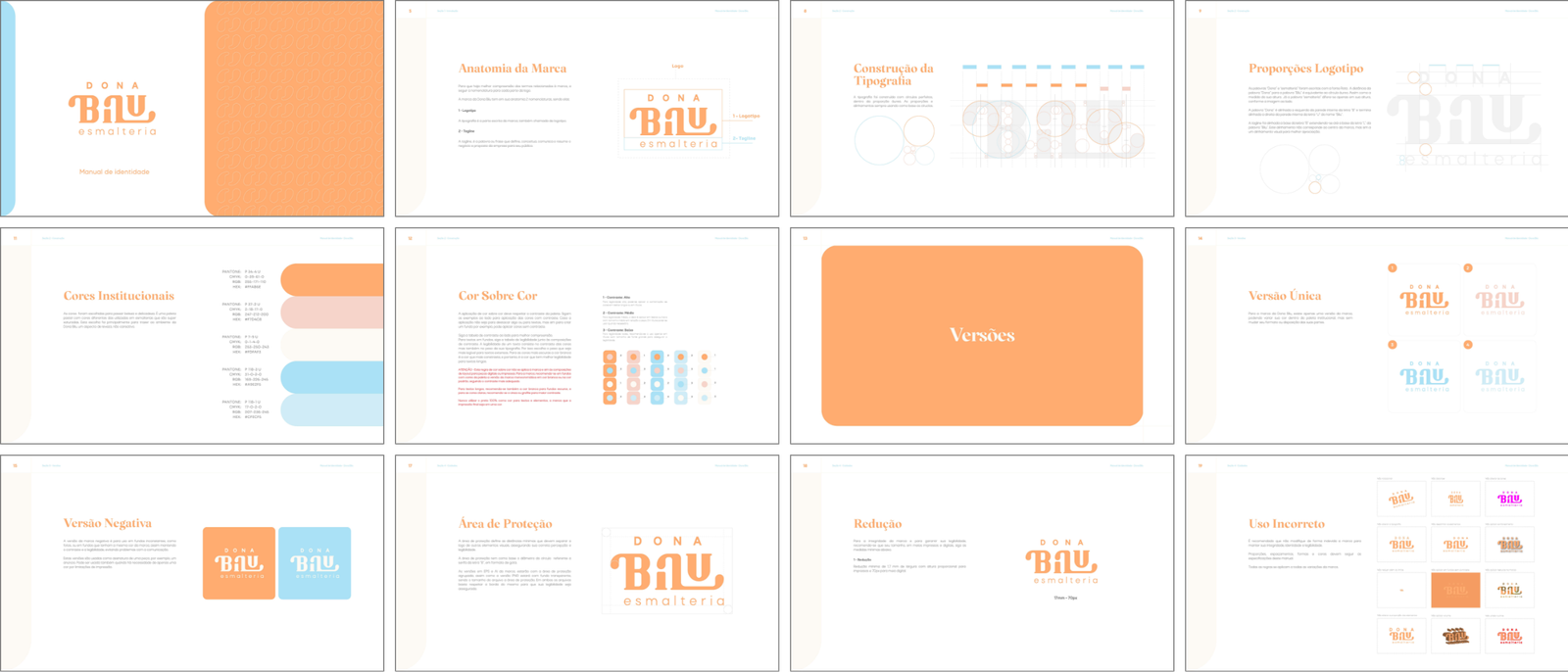
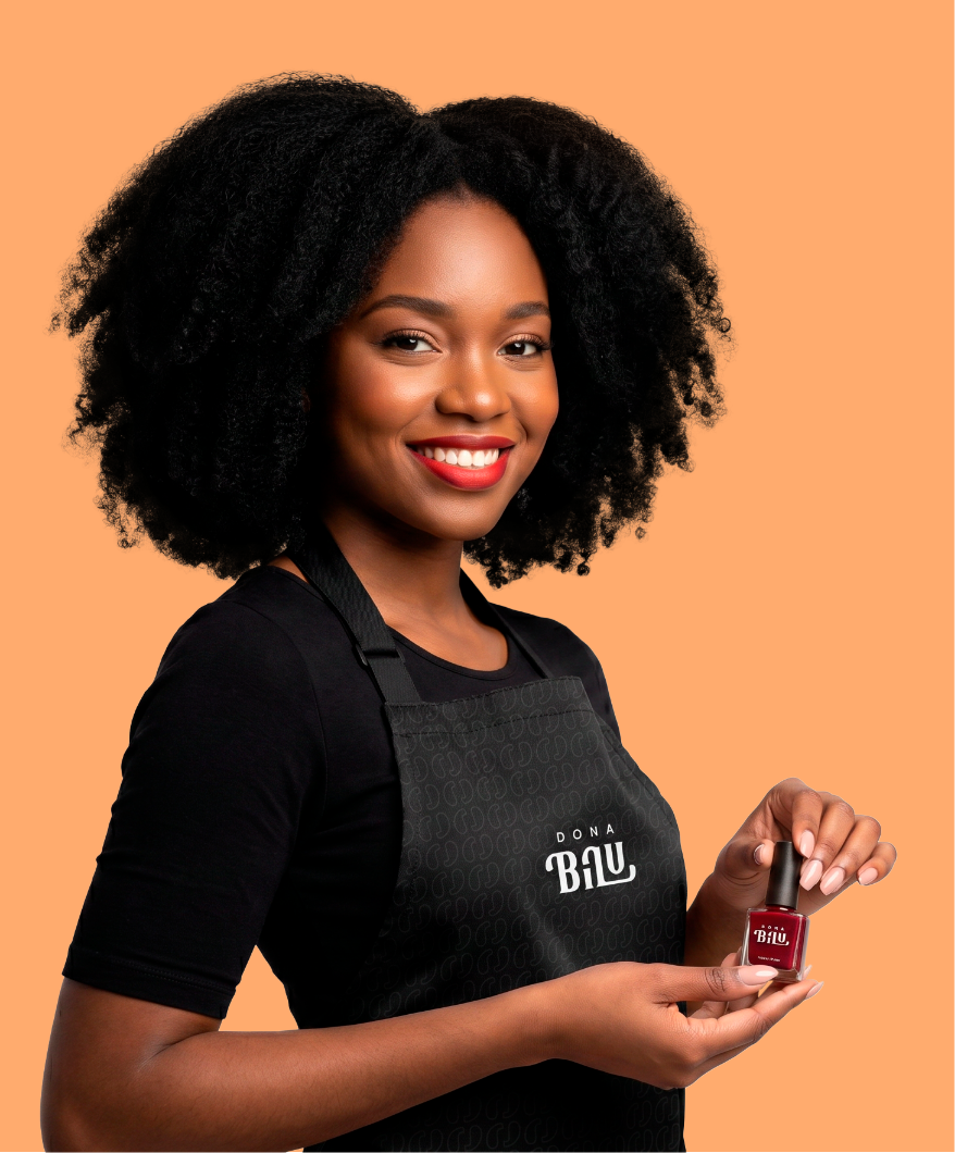
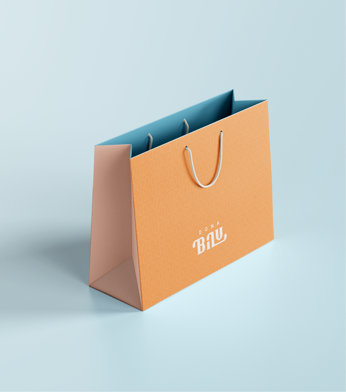
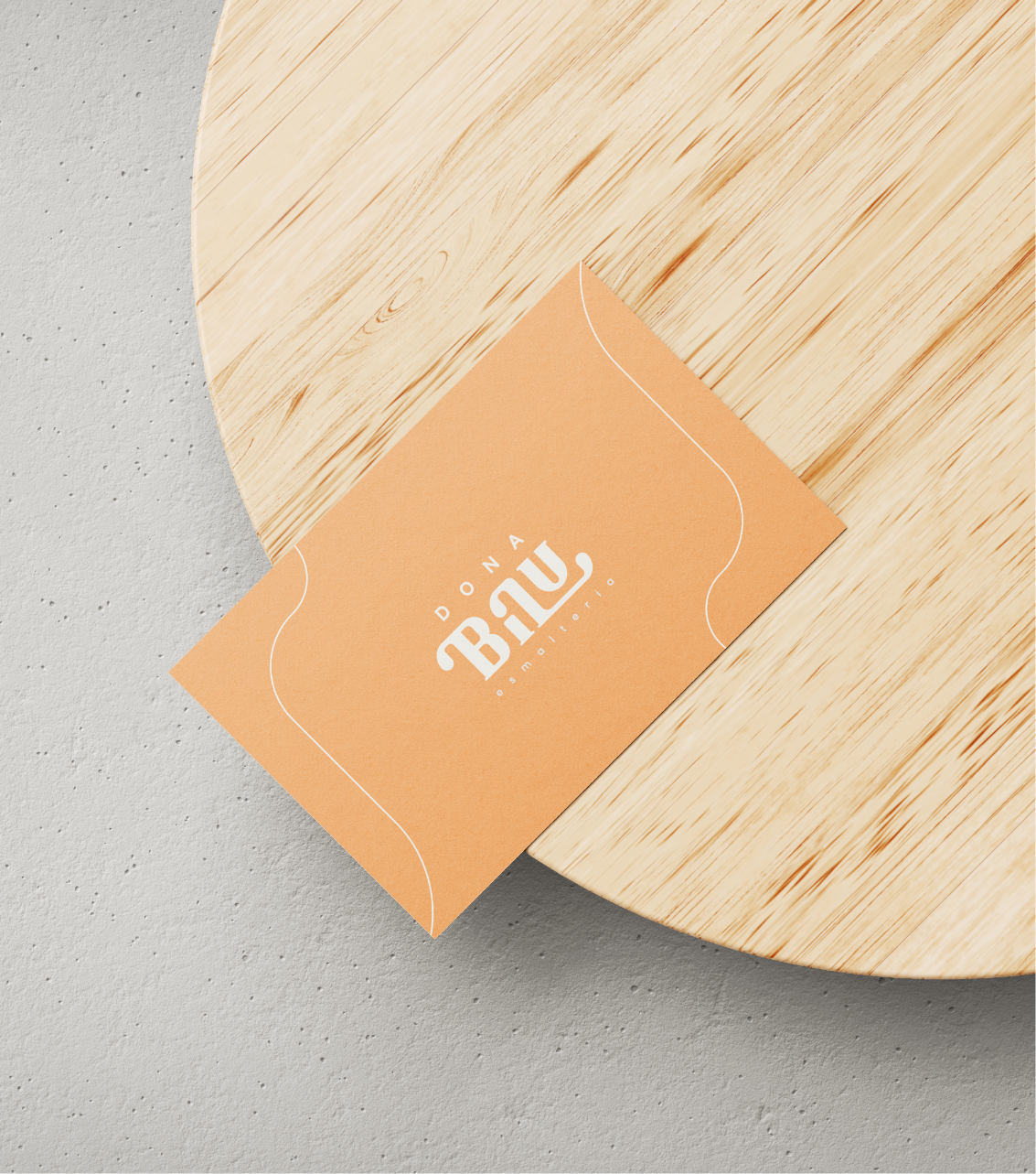
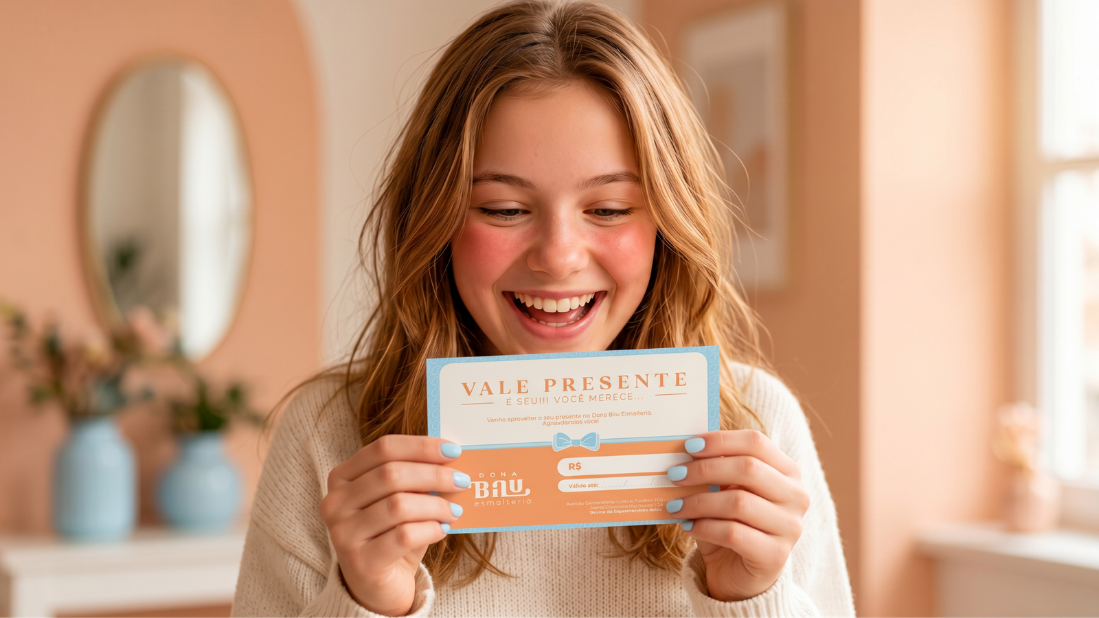
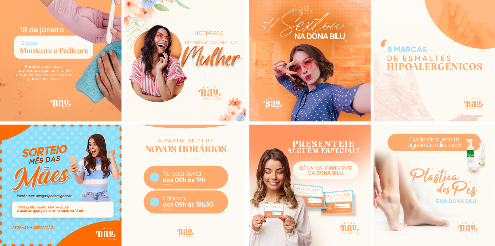
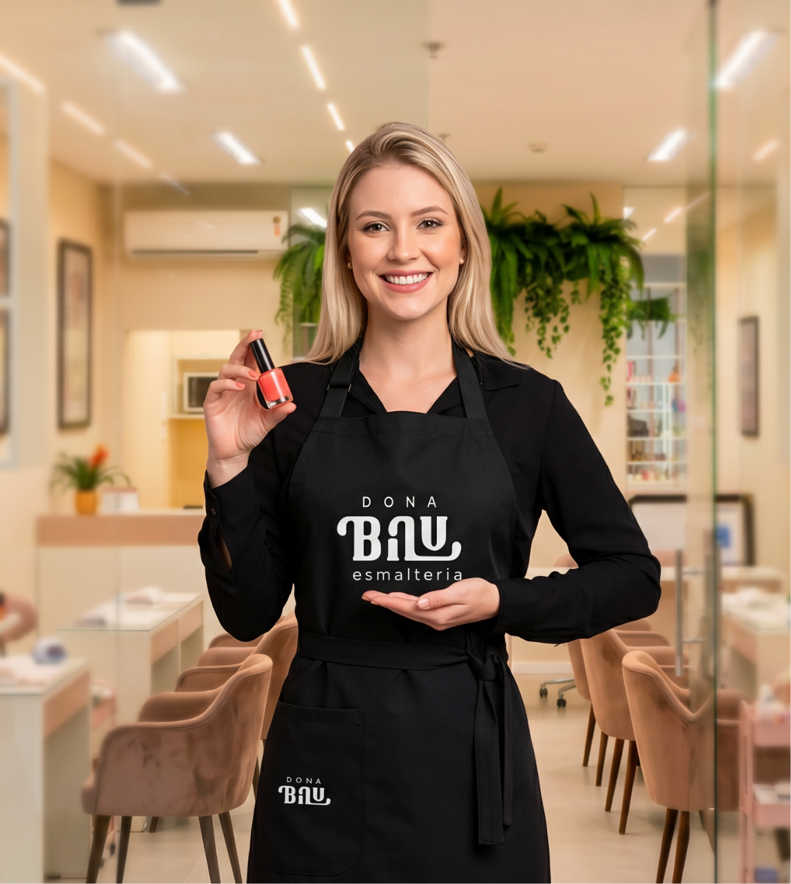
The brand application system was designed to preserve its delicacy and legibility across different formats, maintaining consistent and sophisticated communication in both print and digital materials while continuously reinforcing Dona Bilu's welcoming and elegant personality.